Today Pasquines is introducing Bien Logo, a new blog devoted to reviewing logos, websites, campaigns and anything having to do with design in the political, governmental and public spheres. Why? Because someone has to tell people in Puerto Rico that they are visually contaminating and they need to stop (this is just on design terms, not political ones, so save your fan boy rants). Here is our first installment. Enjoy.
About Leo Diaz
From Wikipedia:
Leonides “Leo” Díaz Urbina (born October 6, 1962) is a Puerto Rican lawyer and politician who served as a legislator in the 24th and 25th House of Representatives of Puerto Rico, and as President of the New Progressive Party of Puerto Rico (PNP) in 2001. Earlier this year, Diaz announced his intention to seek the mayorship of the capital of Puerto Rico, San Juan, looking to face off agaisnt Miguel Romero, Roberto Arango and Kimmey Rashke.
The Identity

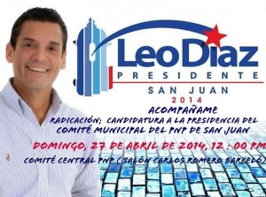
Promotional poster with logo and Diaz’ portrait. (Apologies for poor resolution, there’s no better one available)
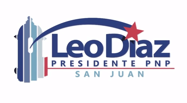
The identity behind this campaign is centered around the logo element and the bricks. The logo is basically an explosion of cliches and overused symbols. Standard star? Check. Blue and red ad nauseam? Check. Swoosh? Check. That being said, it is not the worst political logo I’ve seen. It starts adding some unique flavor with the garita, but that’s about it when it comes to it being unique.
Then that font. One word: kerning. That ‘L’ is tripping the ‘e’ and it is bothersome. Then those colors. 5 shades of blue, and from what I’ve found, no single color version. No alternative color version either, which led to horrible applications of the logo on blue backgrounds with a white glow that make the identity look amateurish. Seriously, not making an alternate version when blue is such a predominant color in political campaigns of the New Progressive Party is a rookie mistake.
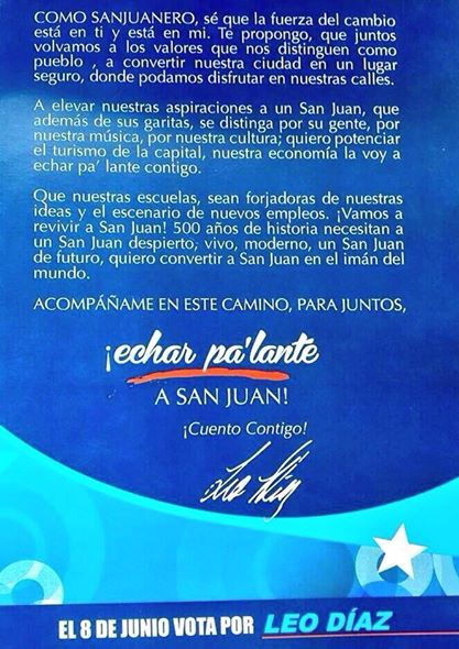
Flyer from before there was a logo. Standard issue signature, lots of blue. No sense.
Flyer sample. WHO IS RESPONSIBLE FOR THAT BODY FONT?
Consistency is the key work. Because it’s missing. The identity, if such a thing has been actually conceptualized, is a hodgepodge of blue the logo and bricks.
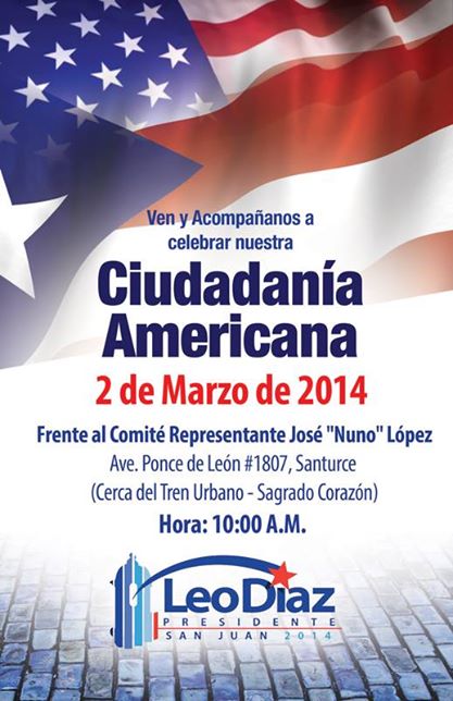
Other flyer. No visual consistency whatsoever.
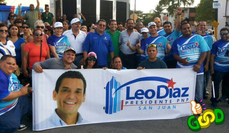
Banner and shirts.
If there was almost a saving grace for this concept it was in the shirts. But no. They’re just swooshes and meaningless lines. And um, again, why isn’t there a white version of the logo?! But I digress.

Cover photo for the YouTube Channel.

Infographics.
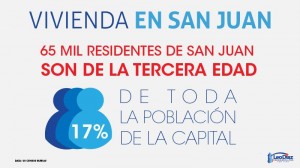
More infographics about San Juan.
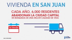
I’m bored with this now.
These cards are kind of good, in a cute way, but they’re missing something. The logo is also way too small to be noticeable. At least they all have the same font and color scheme though.
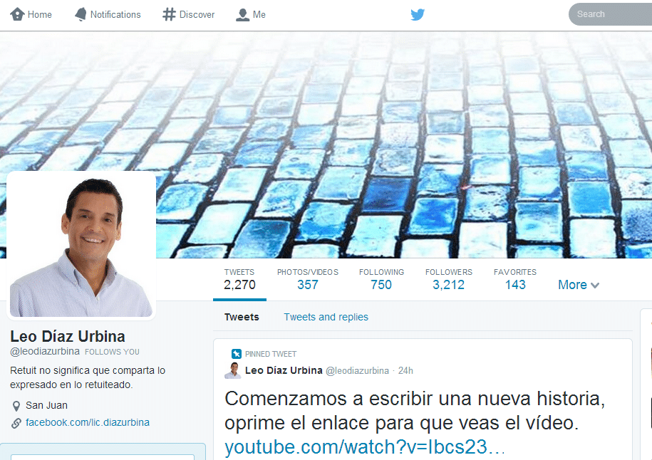
Some semblance of a cohesive identity. But it’s not enough.
Video with most boring logo introduction ever below:
Sample page post:
Overall the concept behind this logo and identity isn’t the worst, but it isn’t the best either. Icons could have played greater prominence if they had been properly developed. Unfortunately this is a case where amateur mistakes hamper the potential for the identity, which we could have seen much clearer if there were a website (like come on! It’s not 1992). We would credit the author, but first, I have no idea and Google does not turn up anything, and secondly, well, it might be better that the world not know who is responsible to be honest.
No website, poor execution and gross violations of basic design rules means this identity should be on zero Pasquines.

