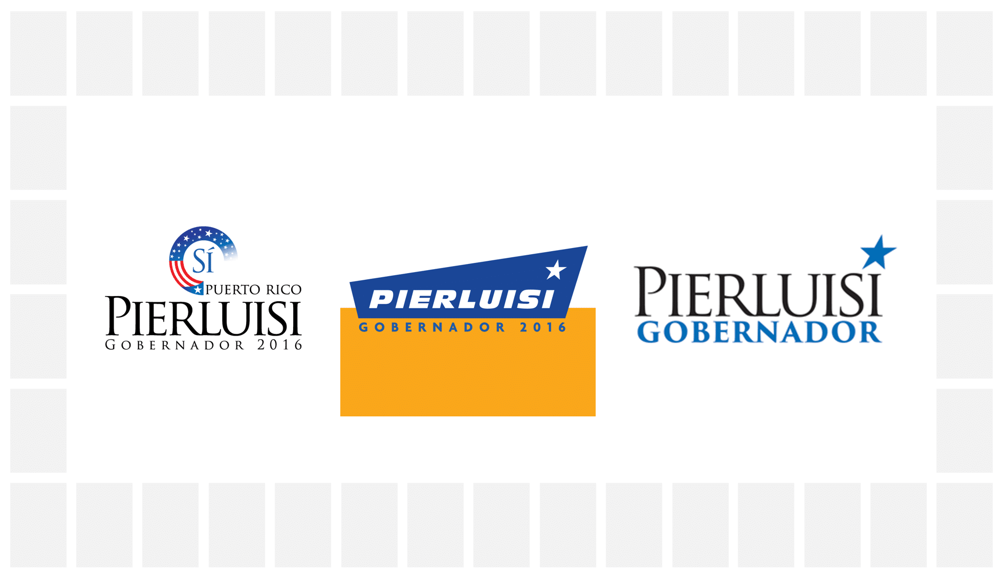
Yesterday we released my review of Pedro Pierluisi’s campaign logo and branding, and just in case you are voting based on who has the better logo (this is a joke), we will review his opponent’s today.
About Ricardo Rossello
From Wikipedia:
Ricardo Antonio “Ricky” Rosselló Nevares (born March 7, 1979) is a college professor, scientist, economist, writer, athlete, entrepreneur and politician. He is a candidate for the New Progressive Party nomination for Governor of Puerto Rico in the 2016 elections. A graduate of the Massachusetts Institute of Technology and the University of Michigan, Rosselló is the son of former Puerto Rico Governor Pedro Rosselló. He has gained worldwide fame among the scientific and medical community for his work on stem cell regeneration.
In 2010, Rosselló founded the political advocacy group Boricua ¡Ahora Es! that supports a change in the political status of Puerto Rico. After several years of political advocacy, on September 20, 2015 Rosselló announced he would seek the New Progressive Party’s nomination for Governor of Puerto Rico at a rally in the Roberto Clemente Coliseum.
About the logo
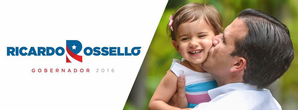
From the get go, you can see this is orders of magnitude better than Pierluisi’s. Personally, I have a very specific set of preferences when it comes to political campaign logos -focus on the last name for professionalism, main identifying simple but meaningful symbol, originality-and this one nails all of them. A strong identifying ‘R’ immediately stands out as the campaign symbol, with bold colors and good design. Attention to detail to small things, like how the shadow of the ‘R”s stem is at the same angle as the joint of the blue bowl with the red leg, is what makes great graphic design. On top of that, the campaign’s solution to making the accent on the last ‘o’ of Rossello a ligature is very elegant. I do wish they would have made the small white space curve along the accent mark, but that’s just me being picky. Overall, the symbol is very direct, being directly reminiscent to Puerto Rico’s flag, while reminding you that this is likely a political logo, for a candidate with an R name, where Rossello has near exclusivity. I do find the star a bit, um, juvenile, but I guess the designers aimed for a friendlier logo.
Font wise, the name of the candidate looks good, thought it does have kerning issues, like with the L-O meeting in Rossello. That said the logo is good enough that we can look past that for the most part, can’t we? The ‘GOBERNADOR 2016’ tagline has a similar enough font (I am not 100% sure it isn’t the same font at a lighter weight) that it does a nice complement.
Everything is rather excellently aligned with the symbol in the middle, and props for that. Overall this is a very strong logo, one I hope the candidate preserves through his political life, should he have a political future. In the field of Puerto Rican campaign logos, this stands among the best, if not the best we have seen in a long time. It might actually be my favorite of this, and perhaps any other season (at this point I think I should state for disclosure and clarification purposes, that I do not support Rossello’s candidacy, the logo is just good).
For Rossello’s sake, I could end the review here, but we should look at his identity.
The identity
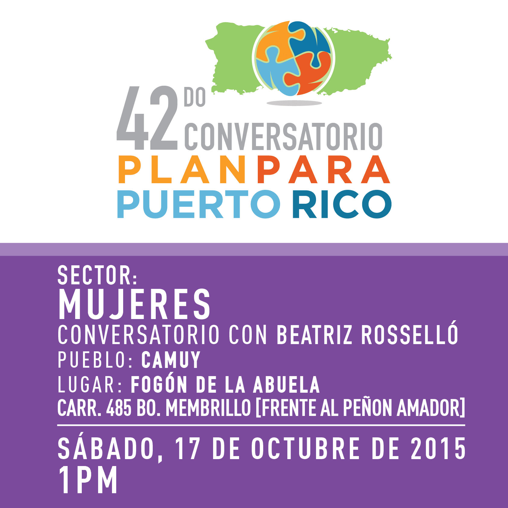
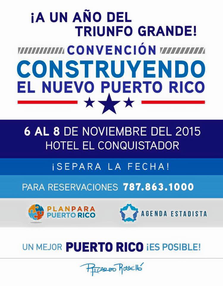
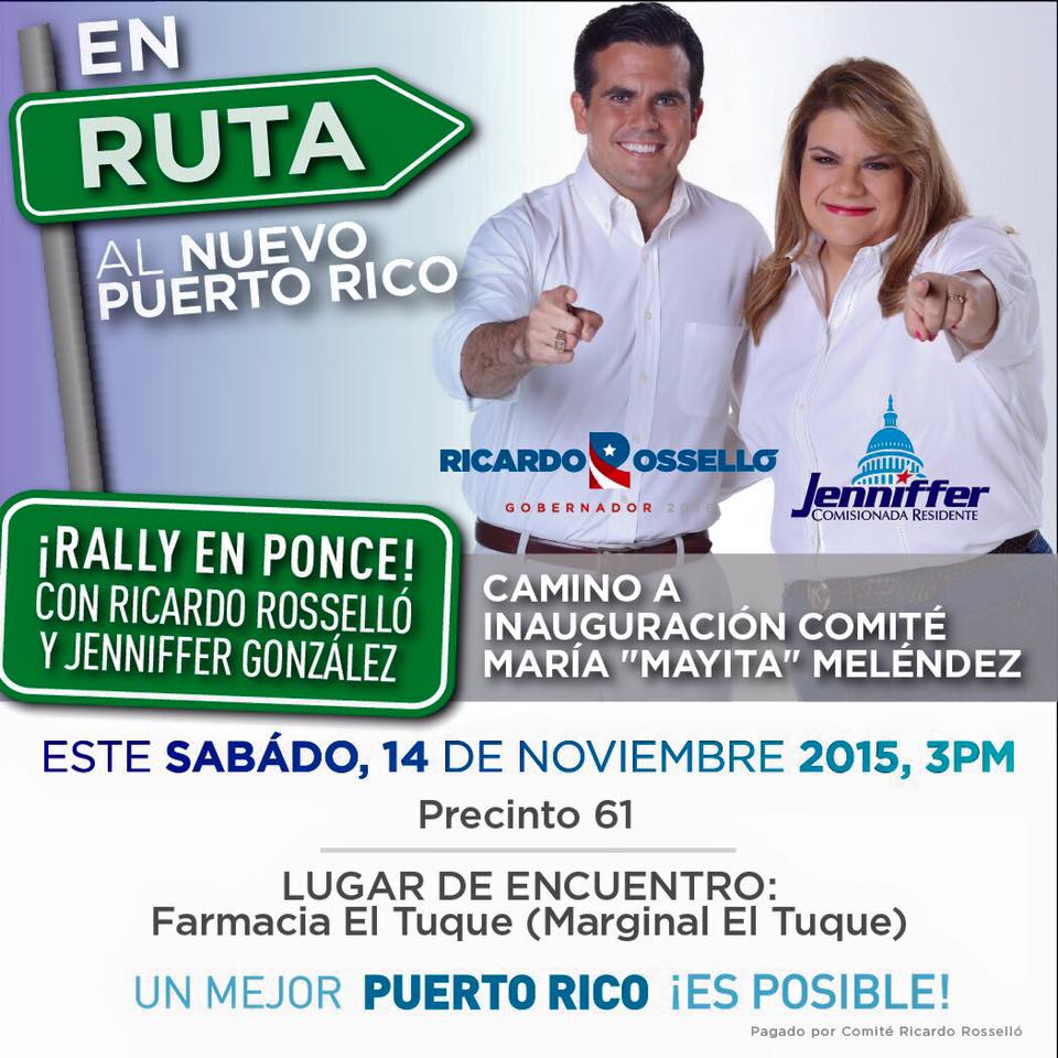
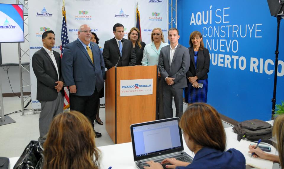
Prior to the official launch of his campaign, Rossello’s team put graphics with discordant and divergent designs that were all over the place. Some were good (the Plan para Puerto Rico identity is quite polished), others, not so much (i.e. those street signs are ugly).
As he introduced his logo, the look improved, for the better, though I do have some bones to pick.
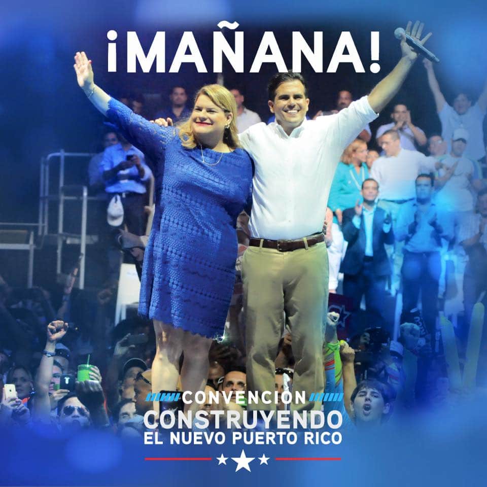
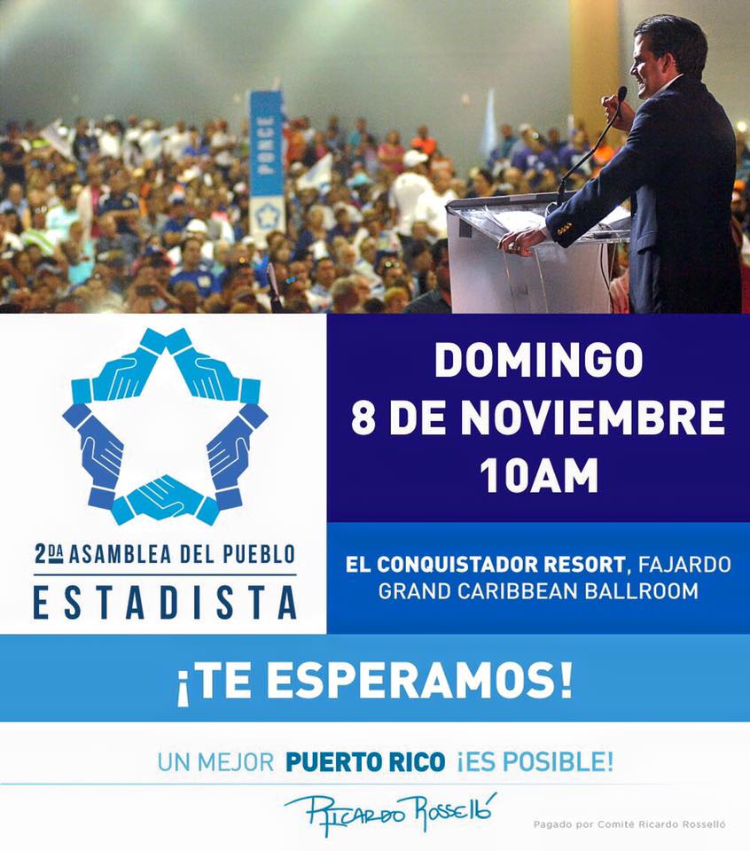
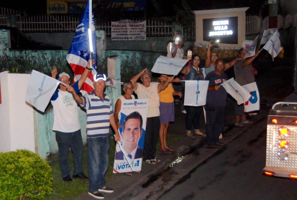
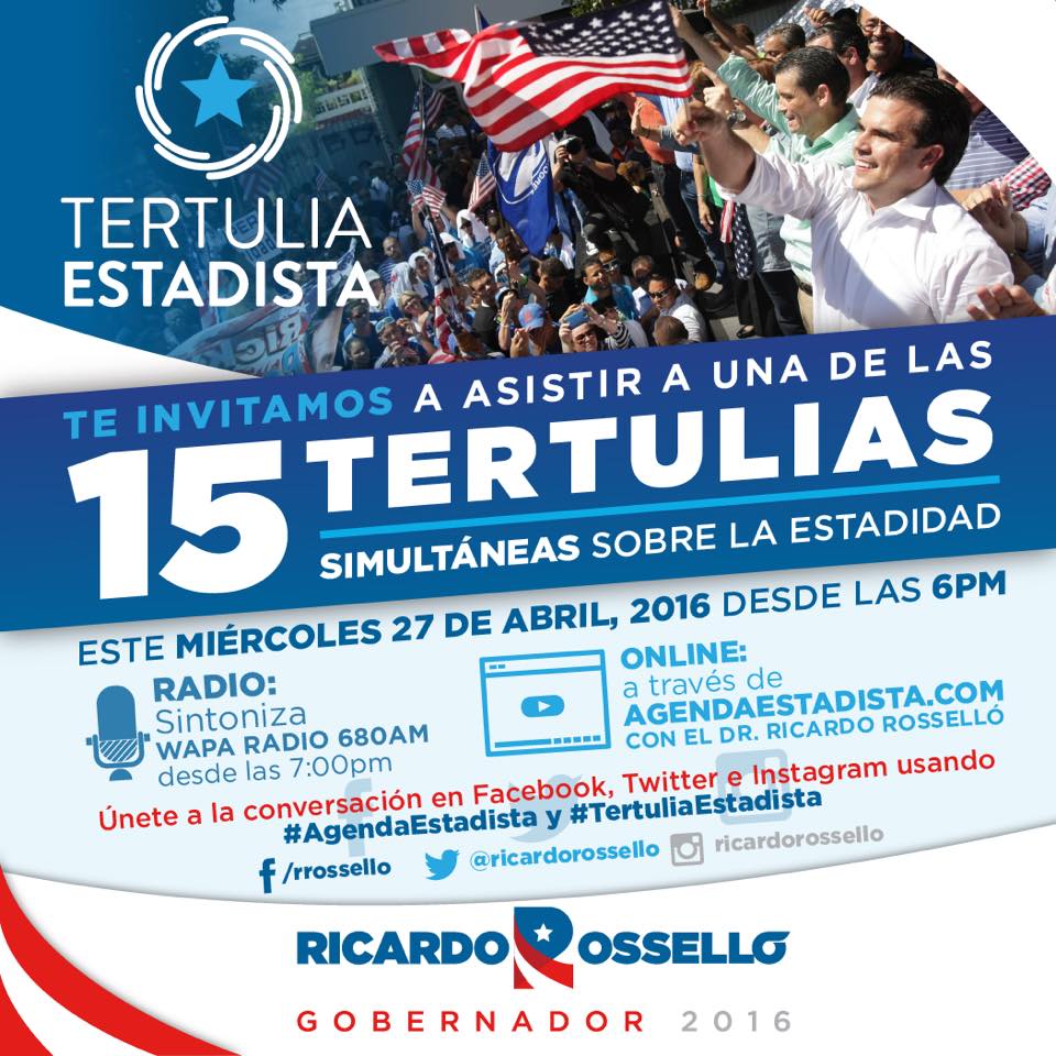
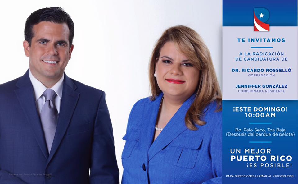
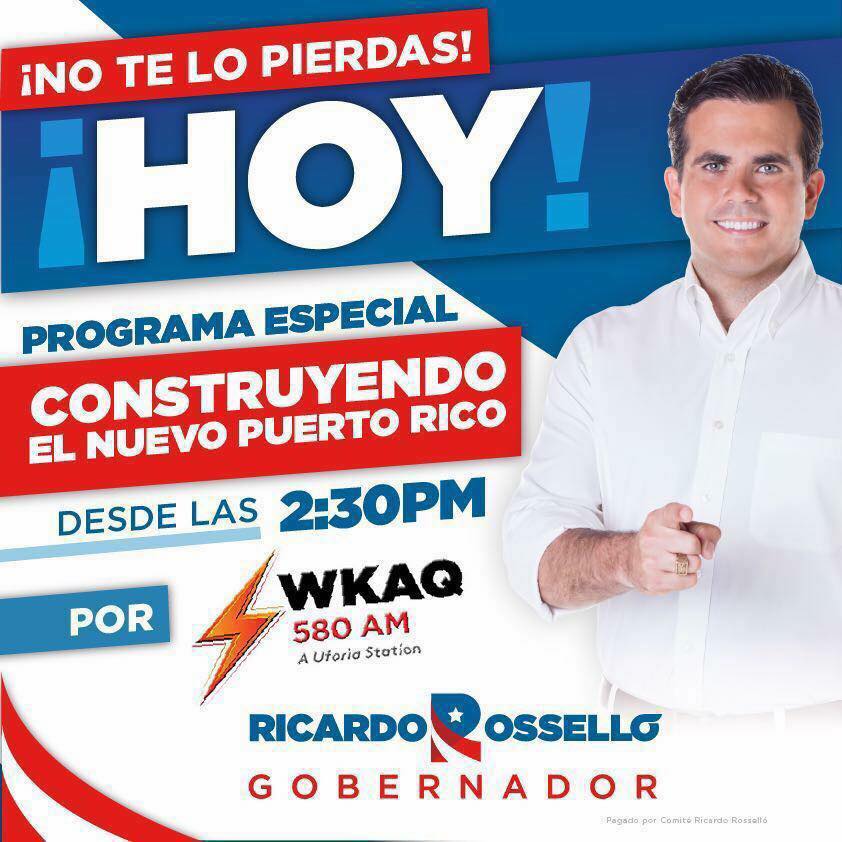
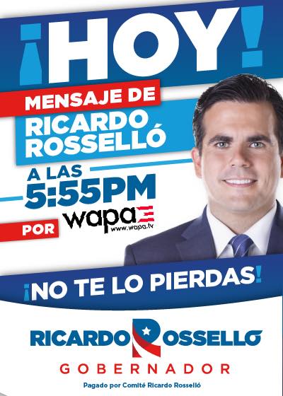
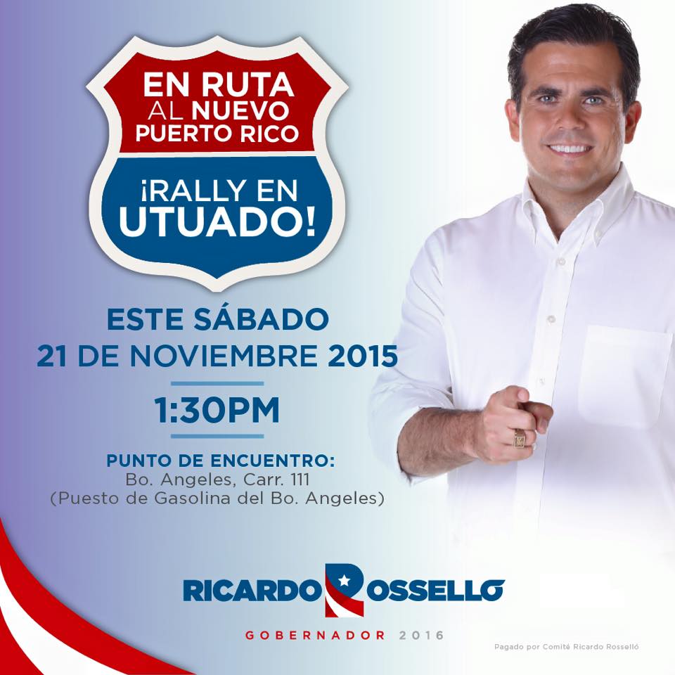
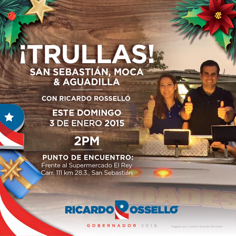
Now things got much better with the logo implemented across the campaign’s materials. Being picky, I hate that they resort to gradients in some flyers, especially when I have seen the same candidate’s picture used in solid backgrounds. Also, you might notice that there is not reverse color version of the logo, which I mean, is just lazy. And given that there is a strong propensity to use blue as a background, a more elegant solution than a white outline should have been found. I understand it would have been challenging, particularly given that the symbol uses the white space between the stem and leg of the ‘R’ as part of its design, and that area does not become transparent in non-white backgrounds, but they could have tried.
The campaign has been very consistent in their font usage, for which they deserve a round of applause. You can stop applauding now, though, because, inexplicably, the campaign does *not* have a website IN THE YEAR TWO THOUSAND AND SIXTEEN. I mean, like, what?
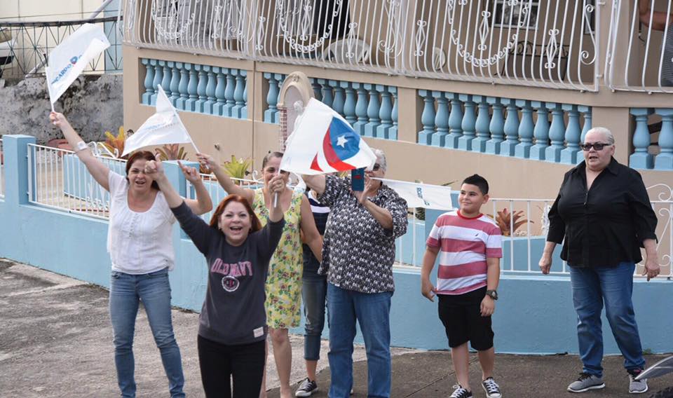
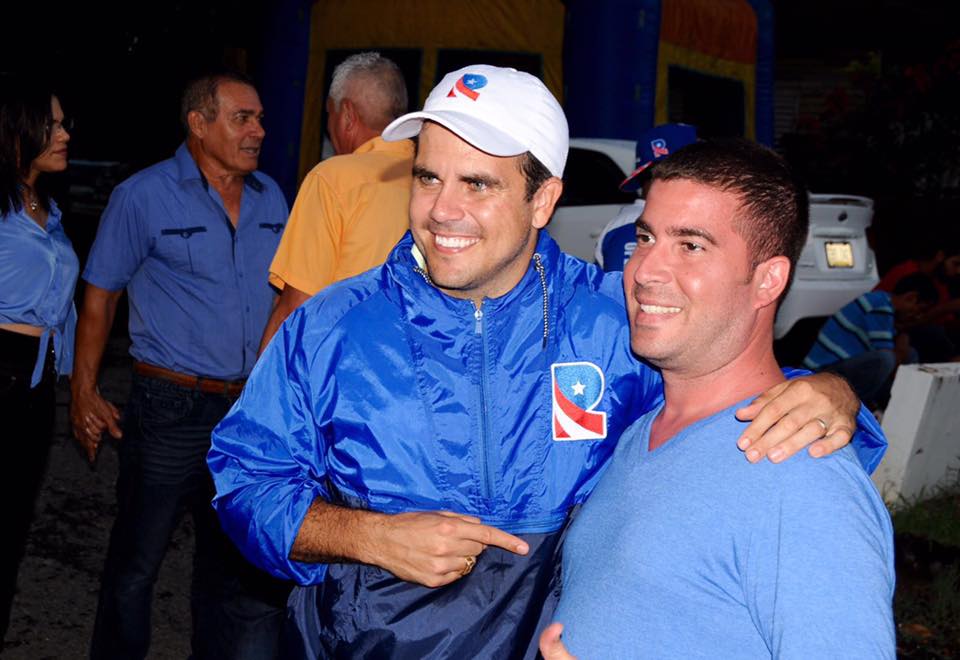
We do get some interesting applications, some I think all candidates should implement, like those ponchos for the endless caravanas, and the white hats with the ‘R’.
We also get random things like an app (screenshot above), and this video, with tacky light animations and logo animation at the end:
Small issues aside, this is a very strong identity. If the candidate wins on Sunday, I’d hope to see a strong evolution (INCLUDING A WEBSITE), that hopefully elevates the standards of political campaign design in Puerto Rico, including that of his running mate.
Purely based off of graphic design, this campaign wins. Not just in the primary, but from everything else I have seen this season in Puerto Rico so far, and which we will review soon here in Bien Logo.
Some might disagree with me, and consider this tacky or cliched, but I will take a well designed cliche before anything else out there. To the other campaigns, be more like this please. I beg.


