About Alexandra Lúgaro
From Wikipedia:
Alexandra Lúgaro (born June 10, 1981) is a Puerto Rican politician and lawyer. She is currently aspiring to be the first independent (no political party affiliation) Governor of the Commonwealth of Puerto Rico. She studied at the University of Puerto Rico School of Law, Rio Piedras Campus. She holds a B.S. in Business Administration. She also holds a Juris Doctor. She is about to finish her doctorate degree from the Madrid Complutense University.
The Logo
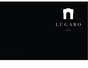
At first glance, this logo is a nice break from the usual, tacky usage of symbols and colors in political logos, particularly in Puerto Rico. The problem is that, well it lacks much symbolism. To me, as much as I want to appreciate the all black, simple approach, this logo lacks any sort of emotion or drive behind it. It feels like a museum or architectural design logo more than anything. The portico symbol, is problematic, with really small details that will not reproduce in small sizes, and most importantly, being immediately unrecognizable (I have reached out to the Puerto Rico Historic Building Drawings Society for help in identifying the actual structure, if it exists), and lacking any clear connection to the candidate, her campaign or her platform (more doors in 2016?).
I really, really, really want to like this, just because of how different it is. And it could have potential, but it fails to captivate, and the font choice does not help. With the main drive behind Lúgaro’s candidacy seemingly being how unconventional she is, her logo almost follows on that trope, then surrenders to using an official looking font (chosen perhaps because it is the same one used on the America Aponte logo). Then there is that 2016 tacked on the bottom, at such a small size that barely makes it readable, and renders it invisible at smaller sizes, with a font that clashes with the serif employed for Lúgaro.
The Application
If there is something I have learned from Under Consideration’s Brand New, it is that sometimes not so good logos can be saved by clever applications. This is not one of those cases because, well, there aren’t any applications to be seen. The candidate seems to be focusing on using her pictures, instead of designed materials for her promotion judging by her social media profiles and (awful) website. The only image I was able to find using the logo was this bizarrely cropped cover photo:
So far, graphics are not Lúgaro’s forte in this campaign. Her identity, from a design standpoint, could use polishing, definition and guidance; basically, actual effort beyond just saying here is a logo and that is it. A logo does not a campaign make, but at the very least, it should set the foundation for a strong cohesive identity that makes a candidate and their message identifiable to voters. This logo fails that standard.
You might see it on some pasquines this election season, but I would not blame you for thinking it’s for a real estate company.

