


Updated logo and branding for Pedro Pierluisi’s gubernatorial campaign

About Pedro Pierluisi
From Wikipedia
Pedro Rafael Pierluisi Urrutia (born April 26, 1959) is an attorney and the current and 19th Resident Commissioner of Puerto Rico. In this capacity, Pierluisi serves as a member of the United States House of Representatives and as the only delegate that represents all U.S. citizens residing in the island. His constituency encompasses about 3.5 million people and, unlike most others, belongs to an at-large congressional district that covers his entire domicile rather than a subdivision of it. Pierluisi’s rights and privileges differ from other congressmen as well, as he is denied a vote on the final disposition of all legislations on the House floor because of his designation as resident commissioner. Still, save for that exception, he exercises his functions like that of any other congressman.
Ideologically, Pierluisi is affiliated with two parties: one within Puerto Rico and another within the United States as a whole. Within Puerto Rico, he is affiliated with the New Progressive Party (PNP in Spanish)—a party that advocates for Puerto Rico to become a state of the United States and that is composed of both Democrats and Republicans. He has also been serving as the party’s president since 2013 and will be competing for the party’s candidacy for governor during primaries. Outside domestic politics, Pierluisi is a member of the Democratic Party of the United States, as well as being a staunch supporter of President Barack Obama and Hillary Clinton.
Before his service in Congress, Pierluisi worked in the private and public sectors as an accomplished litigator. One of his most prominent accomplishments was serving as one of the lead attorneys representing the government of Perú in a lawsuit regarding the trade of silver. In that case, his client was awarded $180 million USD in damages. Another accomplishment was being appointed Attorney General of Puerto Rico. In that role, Pierluisi argued two landmark constitutional law cases before the Supreme Court of Puerto Rico. Afterwards, he practiced law privately for ten years to then return to public service in 2009. At that time, he was elected to his current post, in which he has served for the past seven consecutive years.
Pierluisi is also one of two candidates for governor from the New Progressive Party.
About the logo
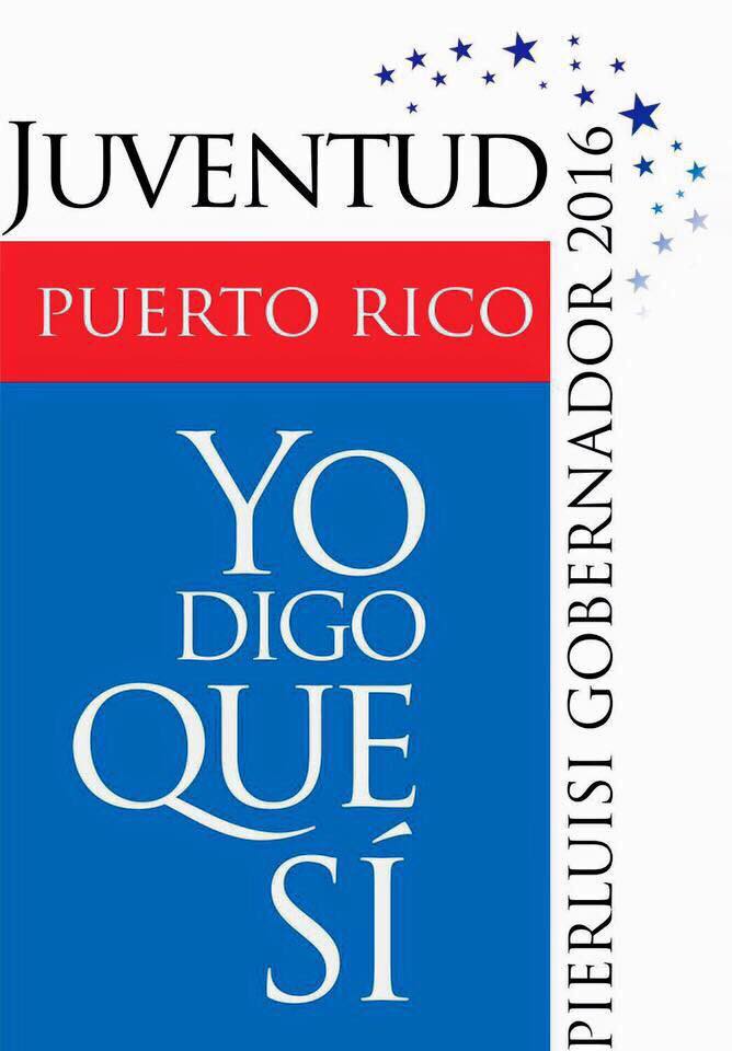
Right off the bat you can see we have 3 files and to be completely honest I am a little confused as to why. When I first thought of writing this post, focusing on the first of the logos, I knew the review would not be positive. Sure, the campaign had done a pretty good job at developing a style, but I hate it.
As a pro-statehood politician, you can expect stars and stripes galore, but this was too much. Too much text, unreadable at small sizes, and hard to reproduce with its gradients and disappearing circle device. It is clear the campaign wanted to drive home the message of the ‘Sí’, but it could have taken a more simplistic, readable and attractive route. Instead they ended up with something that was a graphic cliché, as far as Puerto Rican politics is concerned, and was not anything new or revolutionary.
This was disappointing considering that Pierluisi’s New Progressive Party had undertaken a graphic revamp which was very well executed, but we’ll leave that for another review.

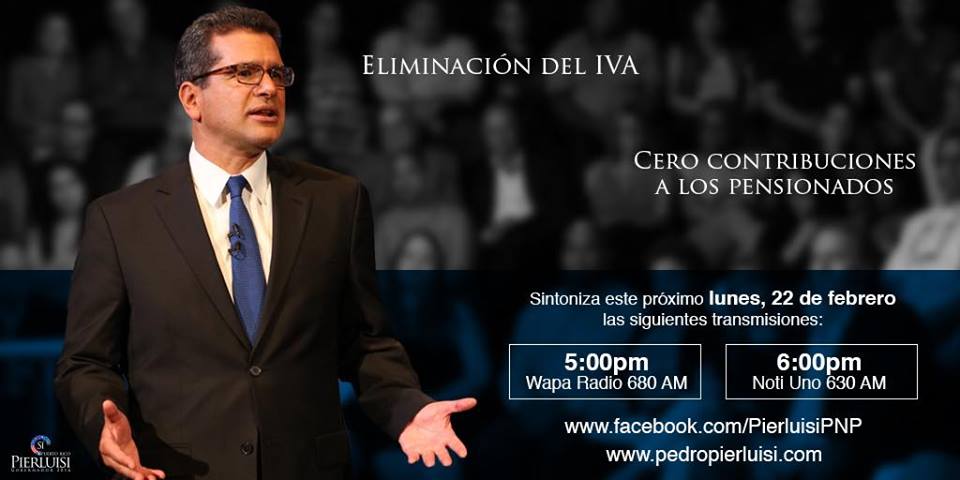
Then, earlier this year, a the middle logo started appearing on social media, flyers and emails. It seemed as though the campaign realized the logo as was did not cut it, and decided to take another approach. This one got a warmer reception from me, because of its simple look, bold font, and clear cut lines. That said, the holding shape lacked any significance, and the star, presumably meant to accentuate a ‘SÍ’, was too far removed to mark that effect. Nonetheless it represented an improvement, kerning issues, and weird fonts notwithstanding.
A short-lived one however.
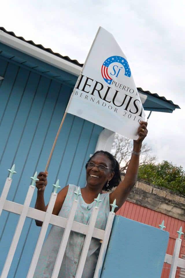
Not a month after the updated logo was released, this new identifier became the primary symbol of the campaign.

Apologies for small size, no larger one available.
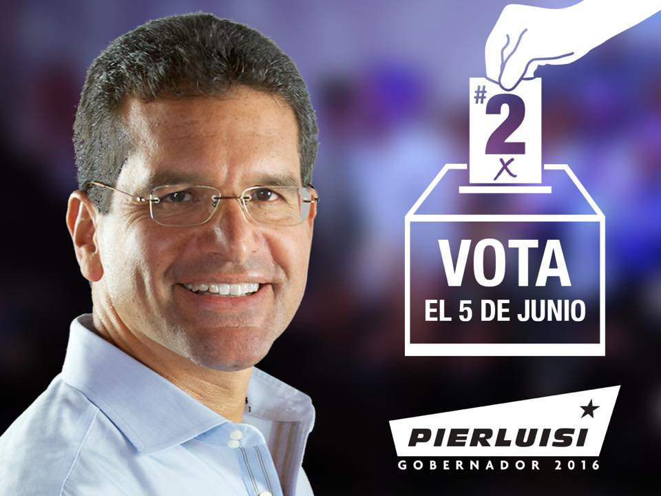
This one is much simpler, but reverts to the Trajan font of the original, while increasing the size of ‘GOBERNADOR’. It is not anything particularly creative or exciting, and there lies it’s biggest fault: it is boring as hell. Add some kerning issues, like that R-L ligature in Pierluisi, or the O’s in ‘GOBERNADOR’ inexplicably mismatching fonts between the only two words in the logo and we have a dud.
Identity & applications
Original identity


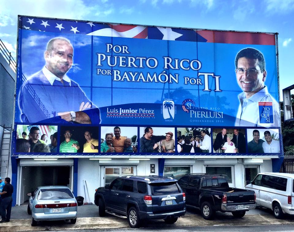
The original identity provided some sort of consistent look, but it slowly diverged as time passed. The campaign then progressed to the second logo mixing new graphics with the first logo.
2nd identity version
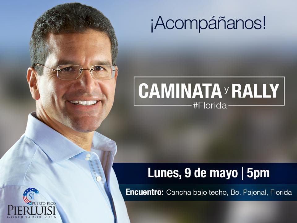
Now after presumably settling on a logo, the style has kept somewhat similar. The issue is that having all these logos shows lack of planning and a sloppy graphic execution that does not help the campaign. In each of its iterations, there was a clear effort to keep a consistent look and identity, but having introduced 3 different ones over the span of a year means consistency is all but impossible.
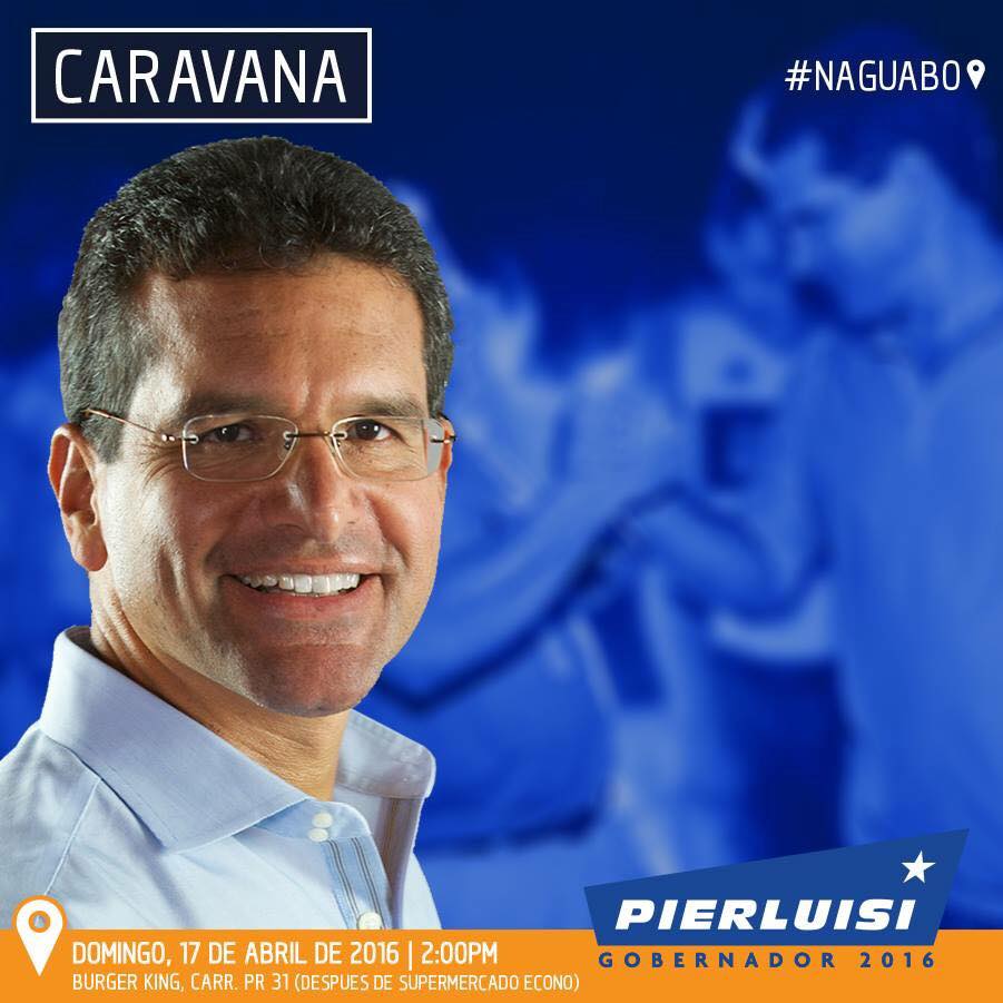
Third identity


Overall a sub par effort, without a clear plan or execution strategy, that ended up being a confusing, mismatched and poorly implemented brand for a campaign that is facing a much better, graphically speaking opponent. Had Pierluisi’s team built upon the identity of the NPP, with its solid font and consistent style, they would have had a much better result.
The effort is better and above average what usually comes from campaigns in Puerto Rico, but for a statewide campaign, in 2016, we should expect better.